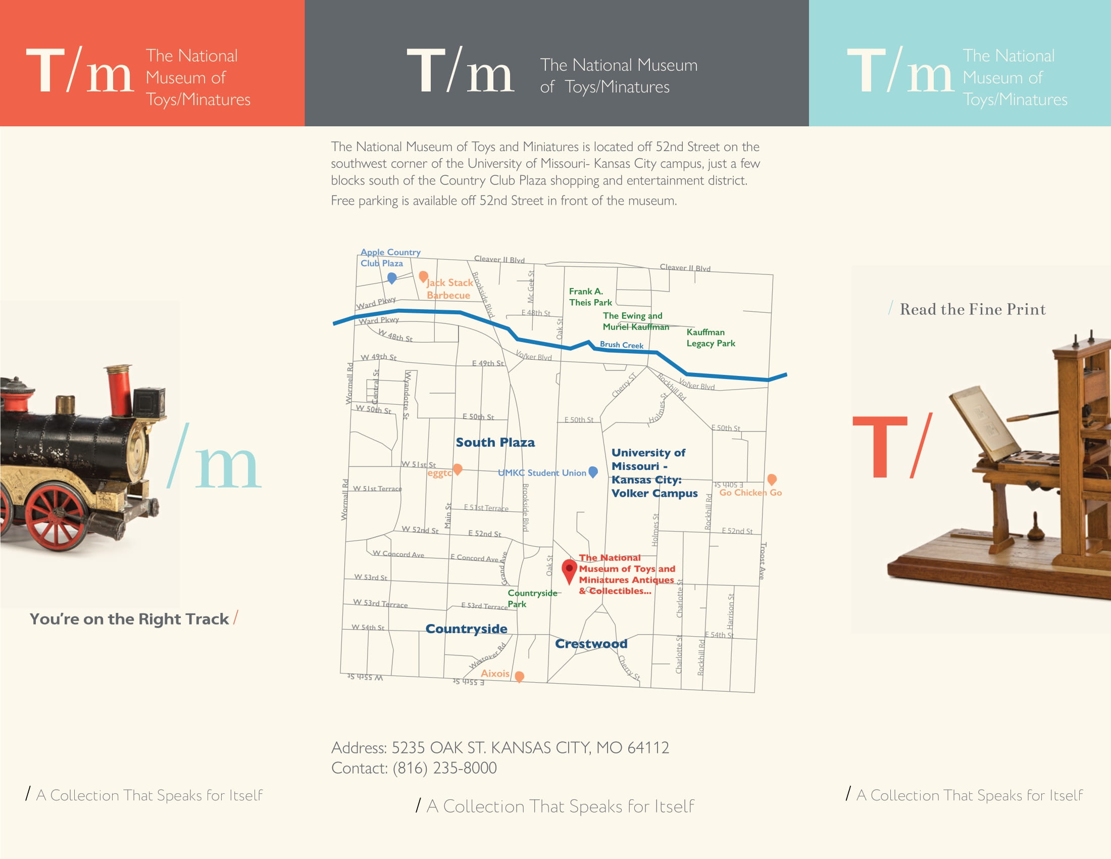
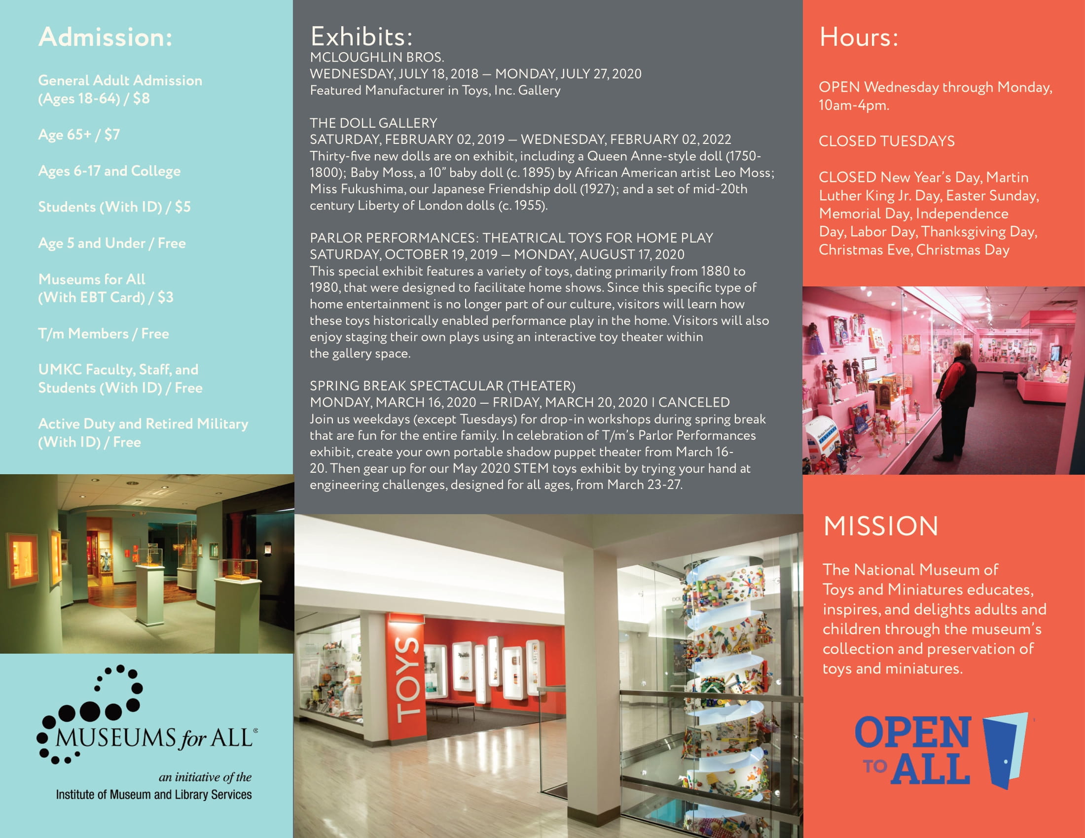
The National Museum of Toys and Miniatures Brochure
For this brochure, I worked within the museum’s established branding guidelines, using their color palette and typography to maintain consistency. I incorporated slogans, visitor information, and imagery from their gallery, blending text and visuals to create a cohesive design. Adding artistic flair, I layered the logo with select images to tie branding with content. A clean, professional example of graphics and design for print media. Credit: The National Museum of Toys and Miniatures.
The National Museum of Toys and Miniatures Brochure Page 1 by Anna Apostolopoulos
The National Museum of Toys and Miniatures Brochuse Page 2 by Anna Apostolopoulos
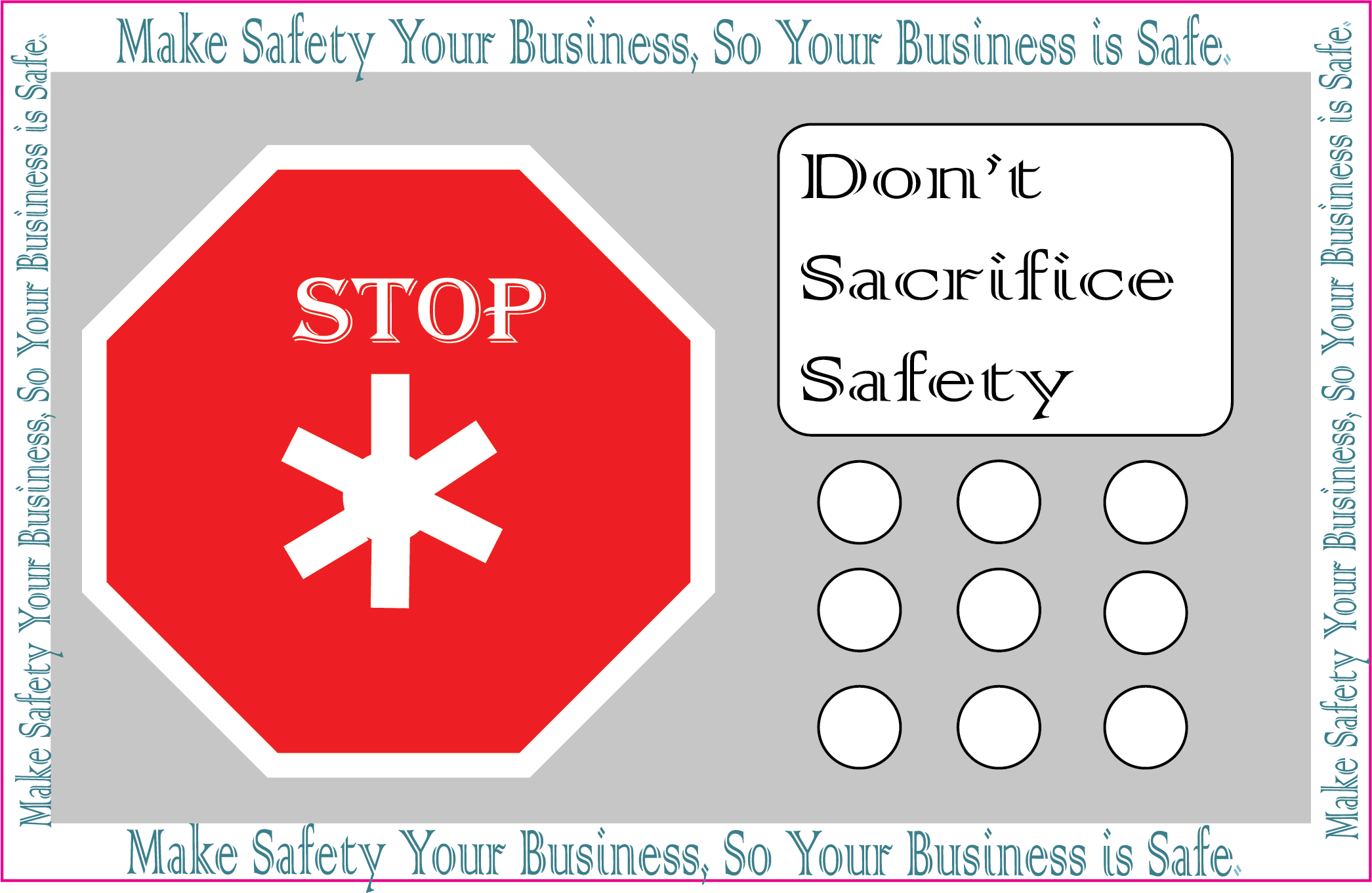
Home Safety Sticker
This sticker design supported the branding of a Home Safety business. Inspired by the control panel of a security system, I incorporated the company’s slogans alongside a stop-sign motif to emphasize deterrence. The design included a transparent background for easy printing and a pink outline for precise cutting. A practical exercise in applied graphics and design. Credit: Home Safety Business, the original company.
Home Safety Sticker by Anna Apostolopoulos
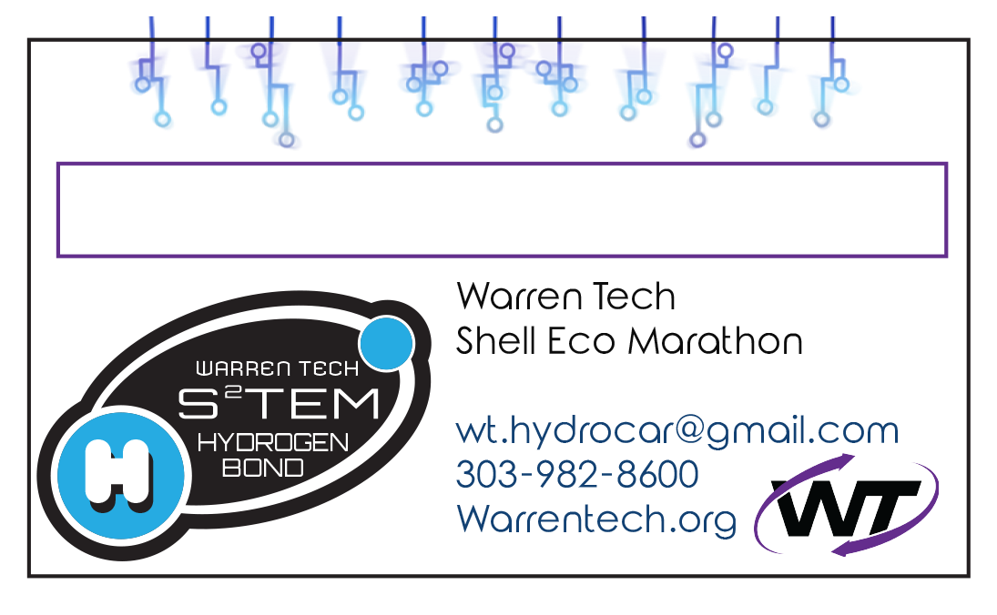
Hydrogen Car Team Rep Business Card
Created for the Warren Tech Hydrogen Car Team’s participation in the Shell Eco Marathon, this business card was designed with a partner. We used the team’s blue and white color palette to align with their branding, integrated essential information, and customized a QR code to match the design aesthetic while keeping it functional. A collaborative example of branding-focused graphics and design. Credit: to my partner and the Hydrogen Car Team.
Hydrogen Car Team Rep Business Card Page 1 by Anna Apostolopoulos
Hydrogen Car Team Rep Business Card Page 2 by Anna Apostolopoulos
Bewitching Fluorescence Snowboard
Designed for Never Summer, this snowboard concept contrasts beauty and danger. A rose in the snow served as the focal point, framed by a forest, mountains, and a starry sky. Footsteps leading into the woods added a sense of mystery and narrative. This design reflects my approach as a graphic designer—merging illustration, storytelling, and applied product graphics. Credit: Never Summer Snowboard Company.
Bewitching Fluorescence Snowboard Sketch by Anna Apostolopoulos
Bewitching Fluorescence Snowboard Breakdown by Anna Apostolopoulos
Bewitching Florescence Snowboard Design by Anna Apostolopoulos
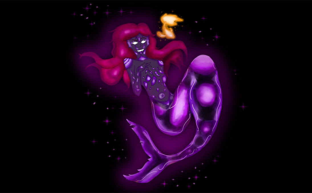
Something Seems Fishy Snowboard
Also designed for Never Summer, this snowboard was inspired by the phrase “There’s more fish in the sea.” I contrasted the cold, snowy context of snowboarding with an underwater scene featuring glowing fish and a bioluminescent mermaid. Warm fish tones balanced with cool mermaid hues created a striking focal point, while a bokeh-style bubble background added depth without distraction. A playful fusion of 3D art concepts with product-based graphics and design. Credit: Never Summer Snowboard Company.
Something Seems Fishy Breakdown by Anna Apostolopoulos
Something Seems Fishy Breakdown by Anna Apostolopoulos
Something Seems Fishy Design by Anna Apostolopoulos
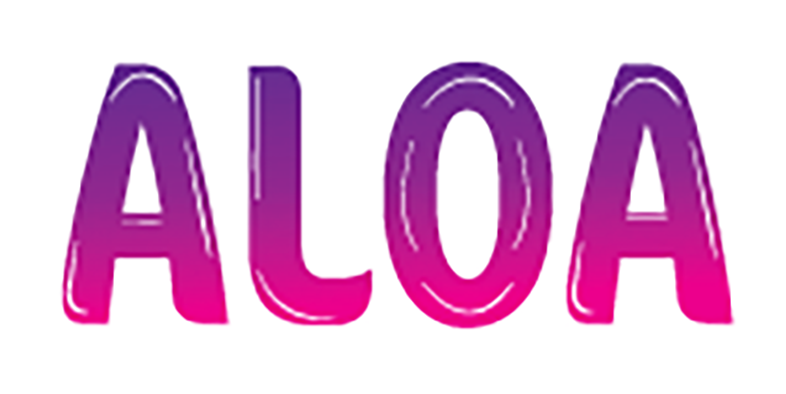
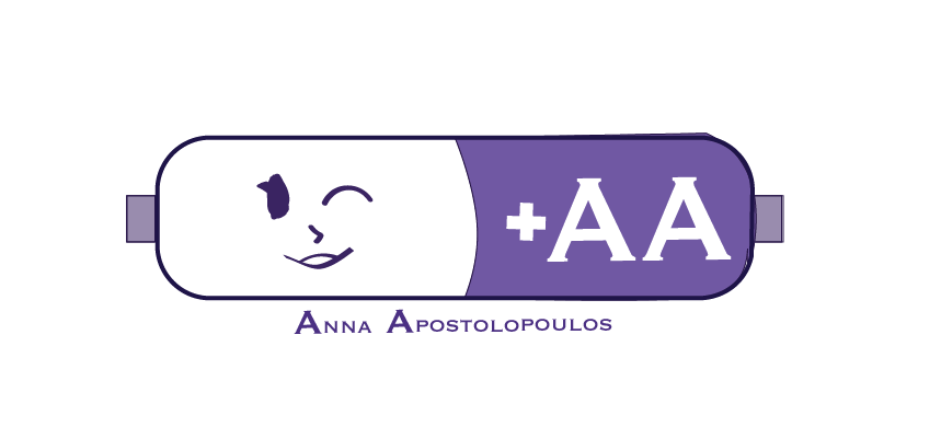
AA Logo
These logo explorations showcase two distinct approaches to personal branding. The first design played on my initials “AA,” stylizing them as a double A battery paired with a sketchy smiley face for a casual, approachable feel. The second design used a rounded bubble font spelling out ALOA (including my middle name), offering a minimalistic yet professional look. Both designs reflect flexibility in logo development and graphic design.
Personal Logo by Anna Apostolopoulos
Personal Logo by Anna Apostolopoulos
Sneak Peak of My Portfolio
I mix imagination with intention—each project starts with your idea and grows into bold 3D art, animation characters, and design that’s anything but ordinary.